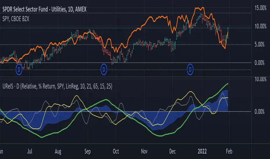
Linear Regression Relative Strength[image/x/iZvwDWEY/
Relative Strength indicator comparing the current symbol to SPY (or any other benchmark). It may help to pick the right assets to complement the portfolio build around core ETFs such as SPY.
The general idea is to show if the current symbol outperforms or underperforms the benchmark (SPY by default) when bought some certain time ago. Relative performance is displayed as percent and is calculated for three different time ranges - short (1 mo by default), mid (1 quarter), and long (half a year). To smooth the volatility, the script uses linear regression to estimate the trend and takes the start and the end points of the linear regression line to compute the relative strength.
It is important to remember that the script shows the gain relative to SPY (or other selected benchmark), not the asset's gain. Therefore, it may indicate that the asset is profitable, but it still may lose value if SPY is in downtrend.
Therefore, it is crucial to check other indicators before making a decision. In the example above, standard linear regression for one quarter is used to indicate the direction of the trend.
Cari dalam skrip untuk "relative strength"
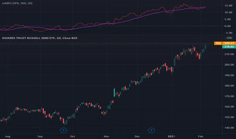
wMRS | Weighted-Mansfield Relative Strength - 4CR CUPThis version of Mansfield Relative Strength ( MRS ) weights the MRSs with different lookback periods by adding the weight of 2:1:1:1 to MRS (1Q) : MRS (2Q) : MRS (3Q) : MRS (4Q).
Typically, the lookback period of a MRS is reference to a full year, i.e. 260 trading dates or 52 weeks; to better represents the relative strength of a stock to a recent performance, someone suggested to add heavier weight on the most recent quarter MRS , i.e. MR(1Q) and the same weight to other quarters, namely, MRS (2Q), MRS (3Q), MRS (4Q).
For some of the stocks you may be interested was IPO not long ago, the lookback period is relaxed for customizing. Once you set the total lookback period, representing the 4Q, in the indicator, the other shorter lookback periods will be auto-calculated, i.e. 1Q, 2Q, 3Q.
A simple moving average of the wMRS is also added for your easier analysis on the trend development of the strength.
RS.ROC | Relative Strength - Rate of Changes - 4CR CUPFor completeness of Relative Strength studies, the Relative Strength based on rate of changes (ROC) with weighting is coded and presented as well.
The RS.ROC is similar to the formulation of RS by IBD before rank among all the stocks in the market.
The lookback period is relaxed for customizing. Once you set the total lookback period, representing the 4Q, in the indicator, the other shorter lookback periods will be auto-calculated, namely, 1Q, 2Q, 3Q.
A simple moving average of the RS.ROC is also added for your easier analysis on the trend development of the strength.
To use it later at your charting later,
1. Favorite it;
2. Select from your favorite list.

RSI Hybrid ProfileThis is a Hybrid Script designed on the basis of a well know Indicator RSI - Relative strength Index, ATR, Standard Deviations and Medians. Effort is being made to present RSI in a Profile based concept to leverage and elevate trading signals and identify potential trade while effectively managing the RISK.
Trend Colour Coding :-
Green = Bullish
Red = Bearish
Gray = Mean Reversion/ Rangebound Markets
The script includes the following Elements
1) Candlestick chart of RSI of current time frame in lower pane :-
It helps to effectively compare the price action with that of RSI to clearly identify early breakouts or breakdowns in RSI as compared to price chart and identify early trade opportunities as well as Divergences
2) Higher Time Frame RSI :-
The orange line in the lower pane to help take analysis of Higher Timeframe, to evaluate and assess trend in more refined manner.
3) Point of Control Zone :-
The middle horizontal band with colour coding to highlight the Point of Control of the price action based on its relative strength.
4) Black Circles - POC Change Markers - RSI profile Value area Shifts :-
All the Black Circles plotted on chart are RSI Point of Controls, which signal upcoming Trend and should be closely watched as it can help identify wonderful Entry/Exit Opportunities.
5) Value Area :-
The horizontal lines above and below the POC Zones are the Value areas, they are extremely useful to identify the potential support/resistance zones during the trending markets and potential target zones during the mean reverting markets. The width also helps assess the underlying volatility and risk and can help in determining the position size based on it. The setting can be adjusted based on Value area Range Multiplier. 1 is the ideal setting as it represents 1 Standard Deviation of Data.
6) Trailing Stops :-
The Green Trailing line helps as trailing stoploss in buying positions and Red Trailing Line helps as trailing SL in Selling Positions. These are especially useful when price is far away from the value area zones or when volatility is very high. The setting can be adjusted based on trail multiplier in the settings.
Here are the few examples of how to use the script on different asset classes
1) Gold Futures - Exhibiting the use of trend and SL and how to change positions based on retracement and RSI Interpretation.
2)Nifty 50 - Exhibiting the importance of POC , RSI Divergence and Breakout and SL Trail and POC Change Markers
3) Bitcoin/US Dollar - Showing the use of Value areas as support zones and using RSI overbought and oversold regions to manage pullbacks and retracement confirmations.
4) JSW Energy Limited - Stock - Showing the combined use of the scripts elements in trading environment.
Feel Free to use it on Charts and leverage the power of this wonderful Indicator.

RSRS (Resistance Support Relative Strength)The Resistance Support Relative Strength (RSRS) indicator, published by Everbright Securities, is a technical analysis tool that enjoys immense popularity among Chinese quantitative traders, owing to its stellar performance in China's stock markets.
🟠 Principle
The indicator treats daily highs and lows as resistance and support levels respectively. It measures market strength by comparing the magnitude of price changes in daily highs versus lows. Specifically, it fits a linear regression model to the (low, high) data points over the past N days (typically 18) and uses the slope (beta) as the RSRS value. A steeper slope indicates stronger market strength.
🟠 Algorithm
1. Collect the daily low and high prices over the past N days.
2. Apply Ordinary Least Squares to estimate the linear regression model: high = alpha + beta * low. The beta is the RSRS value.
3. Compute the z-score of the RSRS over the past M days (typically 600).
4. Compare the z-score to preset buy and sell thresholds (typically 0.7 and -0.7) to generate trading signals. If z-score > buy threshold, a buy signal is triggered. If z-score < sell threshold, a sell signal is triggered.

Crypto Relative StrengthIndicator meant for crypto markets. Computes the relative strength of the current ticker against a target ticker and plots a candlestick chart. Also, plots an exponential moving average of the relative strength.

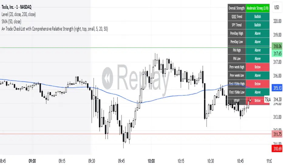
A+ Trade CheckList with Comprehensive Relative StrengthThe indicator designed for traders who need real-time market assessment across multiple timeframes and benchmarks. This comprehensive tool combines traditional technical analysis with sophisticated relative strength measurements to provide a complete market picture in one convenient table display.
The indicator tracks essential trading levels including:
QQQ and SPY trend analysis using exponential moving averages
Previous day and week high/low levels for key support and resistance
Market open levels from the first 5 and 15 minutes of trading (9:30 AM ET)
VWAP positioning for institutional price reference
Short-term EMA positioning for momentum assessment
Advanced Relative Strength Analysis
The standout feature of this indicator is its comprehensive 8-metric relative strength scoring system that compares your current ticker against both QQQ (Nasdaq-100) and SPY (S&P 500) benchmarks.
The 4-Metric Relative Strength System Explained
Metric 1: Relative Strength Ratio (RSR)
Purpose: Measures whether your ticker is outperforming or underperforming relative to its historical relationship with the benchmarks.
How it works:
Calculates the ratio of your ticker's price to QQQ/SPY prices
Compares current ratio to a 20-period moving average of the ratio
Scores +1 if ratio is above average (relative strength), -1 if below (relative weakness)
Trading significance: Identifies when a stock is breaking out of its normal correlation pattern with major indices.
Metric 2: Percentage-Based Relative Performance
Purpose: Compares short-term percentage changes to identify immediate relative momentum.
How it works:
Calculates 5-day percentage change for your ticker and benchmarks
Subtracts benchmark performance from ticker performance
Scores +1 if outperforming by >1%, -1 if underperforming by >1%, 0 for neutral
Trading significance: Captures recent momentum shifts and identifies stocks moving independently of market direction.
Metric 3: Beta-Adjusted Relative Strength (Alpha)
Purpose: Measures risk-adjusted performance by accounting for the ticker's natural volatility relationship with benchmarks.
How it works:
Calculates rolling beta (correlation and variance relationship)
Determines expected returns based on benchmark moves and beta
Measures alpha (excess returns above/below expectations)
Scores based on whether alpha is consistently positive or negative
Trading significance: Identifies stocks generating returns beyond what their risk profile would suggest, indicating fundamental strength or weakness.
Metric 4: Volume-Weighted Relative Strength
Purpose: Incorporates volume analysis to validate price-based relative strength signals.
How it works:
Compares VWAP-based percentage changes between ticker and benchmarks
Applies volume weighting factor based on relative volume strength
Enhances score when high relative volume confirms price movements
Trading significance: Distinguishes between genuine institutional-driven moves and low-volume price action that may not sustain.
Combined Scoring System
The indicator generates 8 individual scores (4 metrics × 2 benchmarks) that combine into a single strength assessment:
Score Interpretation
Strong (4-8 points): Ticker significantly outperforming both benchmarks across multiple methodologies
Moderate Strong (1-3 points): Ticker showing good relative strength with some mixed signals
Neutral (0 points): Balanced performance relative to benchmarks
Moderate Weak (-1 to -3 points): Ticker showing relative weakness with some mixed signals
Weak (-4 to -8 points): Ticker significantly underperforming both benchmarks
Display Format
The indicator shows results as: "Strong (6/8)" indicating the ticker scored 6 out of 8 possible points.
MRS | Mansfield Relative Strength - 4CR CUPThere are many investors referring to Relative Strength (RS) indicator published by Investor’s Business Daily (IBD) for their analysis. Since the RS published by IBD is a proprietary indicator, no exact formulation is published on it.
Many discussion suggested that an alternative to the IBD RS is the Mansfield Relative Strength .
There are 2 parameters for Mansfield Relative Strength setting, namely the market index and the lookback period, n. the default setting of Mansfield Relative Strength adopted by Stan Weinstein was “SPY” and “52” in weekly chart and “200” in daily chart .
Stan Weinstein used the Mansfield Relative Strength indicator on weekly charts. He suggested the breakouts out of a base had to go together with rising relative strength . The Mansfield RS needs to be rising and close to or above 0.
This version of Mansfield Relative Strength relaxes these input parameters for your own choice.
The market index can be set to other market index, e.g. NDX, DJI, NI255, MOEX , TAIEX , HSI , etc. and the lookback period is relaxed to integral input, e.g. 60, 90, 150, etc.
Mansfield Relative Strength
The Relative Strength indicator adopted by Stan Weinstein in his book: “Secrets For Profiting in Bull and Bear Markets” is formulated as Mansfield Relative Strength ( MRS ).
The formula of this indicator is based on the regular Dorsey RS (DRS):
DRS = Price_stock / Price_index
MRS = 100 * (DRS_today / sma (DRS, n)) - 1)
Where:
DRS = Dorsey Relative Strength
SMA = Simple moving average over n days.
The Mansfield Relative Strength formulates as the change of ratio of DRS to its own n-day moving average, this means:
MRS equals to 0 if the DRS is exactly equal to its n day moving average.
MRS is negative if the DRS is below its n day moving average.
MRS is positive if the DRS is above its n day moving average.
Using Mansfield Relative Strength
The MRS tells the relative price movement of the stock to the market index in a period of time concern. As with the Dorsey RS , you can use Mansfield RS to examine if a stock performs better than the market.
This indicator has the advantage over the Dorsey RS that in Dorsey RS only trend matters while for Mansfield RS the values whether below or above the 0 also matters. This allows us to screen for stocks with a MRS value above 0. When we see that the MRS is far above 0 and has been above 0 for some time, we have found a stock that outperforms the market heavily. We can buy this kinds of stock when dips occur.

GA - Comparative Relative StrengthGA - Comparative Relative Strength is an Oscillator. It shows the Relative Strength of a Financial Instrument .
It defines the Relative Strength in relation to Markets, Sectors, Sub-sectors ETFs . Besides, it includes also Currency Indices and the manual selection of Financial Instruments.
Groups of ETFs and Manual Selection
You enable the Group of Financial Instruments that collects the ETF in your interest. Besides, you can enable more that one group. This lets you show Relative Strength Curves related to ETFs of the groups selected.
For example, it can show the Relative Strength related to Market and Sector ETFs. Besides, you can show the Relative Strength related to Sector and Industry ETFs.
The Groups of ETFs are SPDR Categories:
SPDR Core ETFs.
SPDR Select Sector ETFs.
SPDR Industry ETFs.
An extra group includes Currency Indices.
Oscillator around Zero
The Relative Strength of 2 Financial Instruments waves around a borderline. This line is a mean. The GA - Comparative Relative Strength normalizes the curve to the borderline. This makes an Oscillator around Zero.
Upper and Lower Bands
Upper and Lower Bands can follow the full curve. But you can Enable or Disable the visualization of Partial Bands. They follow the curve only for positive waves or for negative waves.
Bands are dynamic levels. Their role is to define where the Relative Strength becomes relevant or normal. When the Relative Strength persists above the Upper Band, Financial Instrument is strong. When the Relative Strength persists below the Lower Band, Financial Instrument is weak.
The Upper and Lower Bands are relevant tools in the decision process to enter the market long or short.
You need to buy Financial Instrument that is outperforming the related market. In the same way, short/sell financial instruments that are under-performing the marketplace.
A Relative Strength that decreases below the Upper Band shows a weakening. A Relative Strength that increases above the Lower Band shows a reinforcement. These indications can precede an eventual change of sentiment of large investors.
Currency Indices
The difficult part is when you want to define the Relative Strength of a Currency Pair. In this case, you can compare a pair with a group of other related pairs. In the same way, you can try to use a Currency Index or a specific calculation.
The use of a Currency Index shows limitations to define the Relative Strength in a proper way.
But an expert trader can define it in different ways so as with different tools. Besides, an expert trader knows the pairs included in the currency index. Moreover, he knows the formula and the weights of the currency pairs included in the index.
The GA - Comparative Relative Strength gives you a collection of Currency Indices. You can enable it and use the Currency Index you need.
Note: I restrict access to the tool.
Regards
Girolamo Aloe
Founder of Profiting Me
------------
Examples
Comparative Relative Strength of APD on SPY (Market Composite Average)
Comparative Relative Strength of APD on XLB Materials Sector
Comparative Relative Strength of ADP on SPY and ADP on XLB

IBD Style Relative Strength RatingWelcome to the IBD Style Relative Strength Rating Indicator!
A powerful tool inspired by Investor's Business Daily (IBD), this indicator helps traders evaluate stock performance relative to a benchmark. It’s perfect for identifying strong or weak stocks compared to the broader market, specifically the S&P 500 (SPY). Whether you're a beginner or an experienced investor, this guide will walk you through its features and key concepts, including the RS Line and RS Rating, and how legendary trader Mark Minervini uses similar tools.
Understanding the RS Line & RS Rating
RS Line (Relative Strength Line)
A visual representation of how a stock’s price performs relative to SPY.
Calculated by dividing the stock’s closing price by SPY’s closing price and multiplying by 100.
Rising RS Line → Stock is outperforming SPY.
Falling RS Line → Stock is underperforming SPY.
Helps identify strength or weakness compared to the market.
RS Rating
A numerical score (1-99) measuring stock performance over 252 trading days (1 year) relative to SPY.
Above 80 → Top 20% of performers.
Above 90 → Top 10% (ideal for growth investors).
Weighted average of stock’s price changes over 63, 126, 189, and 252 days.
Key Features Explained
RS Line Color Mode:
Static (default white) or Dynamic (green when rising, red when falling) for quick trend identification.
Comparative Symbol:
Default: SPY. Can be changed to NASDAQ:NDX, AAPL, or other indices/stocks.
Ensure selected symbols have sufficient historical data.
Plot RS New Highs: Marks new 250-day highs with subtle blue circles
Indicates a stock significantly outperforming SPY (potential buy signal).
Plot RS New Lows: Marks new 250-day lows with red circles
Signals underperformance (possible sell or avoid indicator).
Lookback for Display: Adjustable up to 2000 bars for historical trend analysis.
RS Rating Color Scheme
Green: Upward trend (improving RS Rating).
Orange: Neutral/mixed trend.
Red: Downward trend (declining RS Rating).
Dynamic Color Settings
Rising Line Color: Green (default), customizable.
Falling Line Color: Red (default), adjustable.
Advanced Options
Enable Replay Mode: Uses fixed percentile values for consistent RS Rating calculations in backtesting.
RS Rating Table
Displays current RS Rating and values from previous day, week, and month in the top-right corner (daily charts).
Background color reflects trend: Green (up), Orange (neutral), Red (down).
Past values appear in neutral gray for a quick performance snapshot.
How Mark Minervini Uses This Indicator
Mark Minervini, a legendary trader, emphasizes Relative Strength as a core strategy:
Looks for stocks with:
Rising RS Line.
RS Rating above 80-90 (top performers).
RS New Highs to spot breakout candidates.
Avoids stocks with:
Declining RS Line.
RS Rating below 70.
Important Information for Beginners
RS vs. SPY
The indicator compares stock performance against SPY (S&P 500).
Rising RS Line → Stock is beating SPY.
Falling RS Line → Stock is lagging.
Why Use This Indicator?
Helps find strong relative strength stocks, crucial for bullish trends.
New highs/lows on the RS Line signal significant shifts.
The RS Rating quantifies percentile-based performance.
Customization Options
Adjust colors, lookback periods, and marker sizes to match your trading style.
Default SPY comparison is ideal for U.S. traders but can be customized.
Timeframe Considerations
Optimized for daily charts.
Weekly/monthly charts may have limited data availability.
Tips for Crypto Traders (Measuring Altcoins vs. Bitcoin or Total Market Cap)
If trading cryptocurrencies, this indicator can measure altcoins vs. Bitcoin (BTC) or the total crypto market cap (TOTAL):
Comparative Symbol Setup:
Set Comparative Symbol to BTCUSD to compare an altcoin (e.g., ETHUSD) against Bitcoin.
Rising RS Line → The altcoin is outperforming Bitcoin (bullish signal).
Use TOTAL (crypto market cap index) to assess an altcoin’s strength against the total market.
High RS Rating suggests the altcoin is a market leader.
Adjust Look-back Periods:
Crypto markets are volatile, so reduce Look-back for New Highs/Lows to 50-100 bars (about 2-4 months) for shorter-term trends.
Fine-tune based on your trading strategy.
New Highs and Lows:
Watch for new RS Line highs (blue dots) to identify altcoins breaking out against BTC or TOTAL (momentum trading).
New lows (red dots) may signal weakening altcoins to avoid.
RS Rating Interpretation:
Above 80 against BTC or TOTAL → The altcoin is a strong performer.
This aligns with Minervini’s growth strategy for stocks.
Color Dynamics:
Use Dynamic RS Line Color (green for rising, red for falling) to quickly spot altcoin trends against BTC or TOTAL.
Crypto data may have gaps—test indicator settings on different timeframes (e.g., 1-hour or 4-hour charts).
Tips for Getting Started
Apply the Indicator to a stock chart and set Comparative Symbol to SPY.
Watch the RS Line:
If trending upward with new highs and RS Rating > 80, it's a strong candidate.
Use the RS Rating Table to check for trend consistency.
Adjust Opacity Settings for markers to balance visibility and clarity.
This indicator is now ready for public use as of March 18, 2025. Enjoy trading with enhanced insights, and feel free to share feedback or suggestions for future updates!

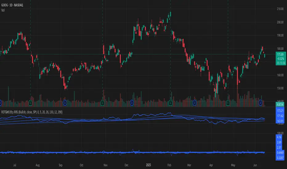
[#ps #mft] RDT's Real Relative StrengthIndicator to use with Pine Screener for filtering watchlists with RDT's Real Relative Strength.
See r/realdaytrading for more info on the RRS.
How to:
1. Mark the indicator as "Favorite".
2. Open Pine Screener.
3. Choose a watchlist.
4. Choose this indicator.
5. Change the settings as needed.
6. Make sure you set timeframe to "5 minutes" and not the default "1 day".
If you choose "Bullish trend", then "Signal X" is a shortcut for RRS > 0 for that timeframe. Similarly "Bearish trend" for "Signal X" means RRS < 0.
Pro-tip #1: use Symbol syncing between tabs to easily go over the results.
Pro-tip #2: you can have two tabs open for "Bullish" and "Bearish" pine screeners (even synced to the same color), so you don't have to change settings everytime.
Islamic Tijarat -Dual Relative StrengthIslamic Tijarat - Dual Relative Strength
Islamic Tijarat - Dual Relative Strength is a powerful indicator designed to compare the relative performance of two securities, such as a stock against its sector index or Nifty 50 (default benchmark) . This helps traders assess whether a stock is outperforming (> 0) or underperforming (< 0) relative to the chosen benchmark.
Key Features:
✔ Relative Strength Comparison – Measure the performance of a stock relative to Nifty 50, industry index, or sector index.
✔ Multiple Timeframes – Works best on Daily Timeframe (TF) but can also be applied to Weekly, Monthly, or Intraday charts based on the preferred calculation period.
✔ Customizable Calculation Period – Choose the desired number of hours when applying it to smaller timeframes.
✔ Box Table Display – Provides a clear performance comparison against both Nifty 50 and the selected sector index .
✔ Toggle Color Option on Crossovers – Visually highlights significant crossovers in relative strength for better readability.
✔ Enhanced Label Display – Fixed label visibility issue when plot options were disabled.
✔ Superimposed Price Action on RS Line – In addition to standard Relative Strength (RS) behavior, users can now overlay price action movements onto the RS line for a more holistic analysis.
✔ Customizable Moving Averages for RS – Added SMA/EMA (length: 9) to smoothen the RS calculation, helping traders filter noise and identify trends more effectively.
Usage:
✅ Compare stock performance against Nifty 50 , industry index, sector index, or any other security within the same sector.
✅ Identify strength and weakness trends over different timeframes.
✅ Use crossovers, trend direction, and price action integration for better decision-making.
This brings enhanced functionality, improved visualization, and bug fixes, making it a must-have tool for traders focusing on relative strength analysis.
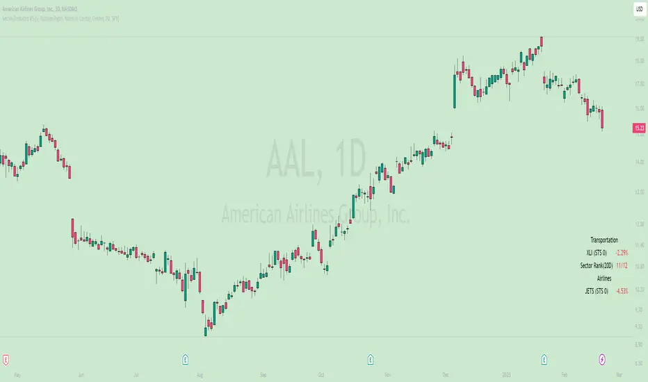
Sector/Industry Relative StrengthOverview
The Sector/Industry Relative Strength (RS) Indicator is a powerful tool designed to help traders and investors analyze the performance of sectors and industries relative to the broader market (SPY). It provides real-time insights into sector and industry strength, helping you identify leading and lagging areas of the market.
Key Features
Sector and Industry Analysis:
Automatically detects the sector and industry of the current symbol.
Displays the corresponding sector and industry ETF.
Relative Strength (STS) Calculation:
Calculates the Sector/Industry Trend Strength (STS) by comparing the sector or industry ETF to SPY over the past 20 days.
STS is expressed as a percentile (0-100), indicating how strong the sector/industry ETF has been relative to SPY over the past 20 days.
Example: An STS of 70 means that during the past 20 days, the ETF’s relative strength against SPY was stronger than 70% of those days.
Sector Rank:
Ranks the current sector ETF against a predefined list of major sector ETFs.
Highlights whether the sector is outperforming or underperforming SPY (green if outperforming, red if underperforming).
Customizable Display:
Choose which elements to display (e.g., sector, industry, ETFs, STS, sector rank).
Customize table position, size, text alignment, and colors.
Real-Time Performance:
Tracks daily price changes for sector and industry ETFs.
Displays percentage change from open to close.
How to Use
Add the Indicator:
Apply the indicator to any stock or ETF chart.
The script will automatically detect the sector and industry of the selected symbol.
Interpret the Data:
Sector/Industry: Displays the current sector and industry.
ETF: Shows the corresponding sector and industry ETF.
STS (Sector/Industry Trend Strength): A percentile score (0-100) indicating the relative strength of the sector/industry ETF compared to SPY over the past 20 days.
Sector Rank: Ranks the sector ETF against other major sectors (e.g., "3/12" means the sector is ranked 3rd out of 12).
Customize the Display:
Use the input settings to:
Show/hide specific elements (e.g., sector, industry, ETFs, STS, sector rank).
Adjust the table position, size, and text alignment.
Change colors for positive/negative changes.
Make Informed Decisions:
Use the STS score and sector rank to identify potential trading opportunities.
Focus on sectors and industries with high STS scores and strong rankings (green).
Input Parameters
Table Settings:
Table Position: Choose where to display the table (Top Left, Top Right, Bottom Left, Bottom Right).
Table Size: Adjust the size of the table (Tiny, Small, Normal, Large).
Text Color: Customize the text color.
Background Color: Set the table background color.
Display Options:
Show ETFs: Toggle the display of sector and industry ETFs.
Show STS: Toggle the display of the Sector/Industry Trend Strength (STS) score.
Show Sector/Industry: Toggle the display of sector and industry information.
Show Sector Rank: Toggle the display of the sector rank.
Parameters:
Sector Rank Time Length: Set the number of days used for calculating the sector rank (default: 20).
Example Use Cases
Sector Rotation:
Identify sectors with high STS scores and strong rankings (green) to allocate capital.
Avoid sectors with low STS scores and weak rankings (red).
Industry Analysis:
Compare the STS scores of different industries within the same sector.
Use the STS score to gauge relative strength and identify potential opportunities.
Market Timing:
Use the STS score and sector rank to time entries and exits in sector-specific ETFs.
Combine with other technical indicators for confirmation.
Real Relative Strength Indicator (Multi-Index Comparison)The Real Relative Strength (RRS) indicator implements the "Real Relative Strength" equation, as detailed on the Real Day Trading subreddit wiki. This equation measures whether a stock is outperforming a benchmark (such as SPY or any preferred ETF/index) by calculating price change normalized by the Average True Range (ATR) of both the stock and the indices it’s being compared to.
The RRS metric often highlights potential accumulation by institutional players. For example, in this chart, you can observe accumulation in McDonald’s beginning at 1:25 pm ET on the 5-minute chart and continuing until 2:55 pm ET. When used in conjunction with other indicators or technical analysis, RRS can provide valuable buy and sell signals.
This indicator also supports multi-index analysis, allowing you to plot relative strength against two indices simultaneously—defaulting to SPY and QQQ—to gain insights into the "real relative strength" across different benchmarks. Additionally, this indicator includes an EMA line and background coloring to help automatically identify relative strength trends, providing a clearer visualization than typical Relative Strength Comparison indicators.

CANSLIM IBD Relative Strength NIFTYSMLCAP250 (Daily & Weekly)This Pine Script (written in version 5) is designed to calculate the IBD Relative Strength for both daily and weekly timeframes, comparing the current chart's security to the NIFTY SMLCAP 250 index. Here's a breakdown of the code:
1. Indicator Initialization: This line sets up the indicator with both a short and full title. The overlay=true means the plot will be drawn on top of the price chart.
2. Fetching Data: This fetches the daily ("D") and weekly ("W") close prices for the NIFTY SMLCAP 250 index.
3. Relative Strength Calculation: Relative strength is calculated as the ratio of the security's current close price to the close price of the NIFTY SMLCAP 250, multiplied by 100 for both daily and weekly timeframes.
4. Timeframe-Based Selection: Here, the script checks whether the chart is in daily or weekly mode and selects the corresponding relative strength value.
5. Scaling with Multiplier: This section ensures there are at least 60 bars of data and scales the relative strength by using a multiplier derived from the 60th previous bar's close price.
6. Plotting: Finally, the scaled relative strength is plotted on the chart in black.
Improvements :
Dynamic Timeframe Handling: You might want to extend this for other timeframes, e.g., monthly.
Customization: You can add user input parameters to adjust the timeframe, scale factor, or period dynamically.
Color Enhancements: You can add color variation to indicate strength/weakness more clearly.

Normalized Relative Strength LineNormalized Relative Strength Line Indicator
Overview
The "Normalized Relative Strength Line" indicator measures the relative performance of a stock compared to a benchmark index (e.g., NSE
). This indicator helps traders and investors identify whether a stock is outperforming or underperforming the selected benchmark over a specified lookback period. The values are normalized to a range of -100 to +100 for easy interpretation.
Key Features
Comparison Symbol: Users can select a benchmark index or any other comparison symbol to measure relative performance.
Lookback Period: A user-defined period for normalization, typically set to a number of trading days (e.g., 252 days for one year).
Relative Strength Calculation: The indicator calculates the percentage change in price for both the stock and the comparison symbol from the start of the lookback period.
Normalization: The relative strength values are normalized to a range of -100 to +100 to facilitate comparison and visualization.
Smoothing: An optional 14-period simple moving average (SMA) is applied to the normalized relative strength line for a smoother representation of trends.
Interpretation
Positive Values (+100 to 0): When the normalized relative strength (RS) line is above 0, it indicates that the stock is outperforming the comparison symbol. Higher values signify stronger outperformance.
Negative Values (0 to -100): When the normalized RS line is below 0, it indicates that the stock is underperforming the comparison symbol. Lower values signify stronger underperformance.
Horizontal Line at 0: The horizontal line at 0 serves as a reference point. Crossing this line from below indicates a shift from underperformance to outperformance, and crossing from above indicates a shift from outperformance to underperformance.
Crossovers: The points where the RS line crosses the moving average (red line) can signal potential changes in relative performance trends.
Example Use Case
If the normalized RS line of a stock consistently remains around +100, it suggests that the stock has been strongly outperforming the comparison symbol over the selected lookback period. Conversely, if it remains around -100, it suggests strong underperformance.

(CA|RS) Caruso Adaptive Relative StrengthCaruso Adaptive Relative Strength helps an investor identify when a stock is performing better than an index on a relative basis. Going beyond traditional Relative Strength(RS) methods, CARS uses a stock's Beta to determine when Relative Strength is present when adjusting for the individual stock's volatility and correlation to its benchmark. Therefore, it allows investors to not only visualize if a stock is outperforming an index but rather if it is outperforming when considering the stock's Beta. This allows Relative Strength to be more easily viewed in lower volatility equities as well as ETFs, Commodities, and alternative assets. To be as effective as possible, I have built CARS to be an RS composite, and it factors in RS from different time periods in making its calculation.
To make the application as simple as possible, I designed CARS to change the background of the chart to blue when Relative Strength is identified. You also have the option to display a box around the data or plot symbols along the bottom of the chart to best suit your visual need. CARS access comes with CARS Signal access which is a separate indicator that plots below the price chart. It provides greater insight into the robustness of the CARS signal by displaying how many core internal components of CARS are displaying RS.
Importantly, you can also change which index or symbol you would like to use for comparison purposes. I have the default set to the S&P 500, but you can use any index, ETF, or security for comparison.
CARS is also adaptable to any time frame.
The greatest benefit in identifying Relative Strength is to discover which stocks are outperforming an index, therefore are undergoing accumulation. It is important to then time your entry into the stock when the price confirms. If an investor is seeking absolute price gains, then this last point of timing an entry is critical because a stock can outperform an index yet still fall - albeit less than the index.

TAPLOT Relative Strength New High Multi LookbackThis indicator will compare your Stock or ETF to any other security of your choice. The indicator a stock's price action to that of the S&P 500. A rising line tells you the stock is outperforming the benchmark index. When looking for stocks to swing trade, I like to build my watchlist from stocks that are showing a rising/strong Relative Strength line.
What differentiates this indicator from others that are available out there is:
Ability to choose any benchmark index to compare to (from ticker pick field in settings)
Plotting Relative Strength New High (Relative Strength NH) and Relative Strength New High Before Price (RS NHBP) on the Relative Strength line by looking back at 3 different lookback periods (3 months, 6 months, and 12 months)
Plotting all history occurrences of RS NH and RS NHBP
By being able to plot NHs from all 3 lookback periods gives you an early heads up on stocks that started to outperform the market early on (3 months RS NHs). The indicator then switches to 6 months plotting Crosses for NHs and then to 12 month lookback when 12 month Relative Strength New Highs are present.
The Relative Strength line itself will be plot on all of your chart timeframes however the RS NH and RS NHBP are only plotted on Daily and Weekly charts.
The indictor is very customizable - you are able to adjust:
Benchmark to compare to
Lookback period (default to Multi/All)
Change the width of Relative Strength line and color
Change the size of Dashes, Crosses, and Circles plotted on RS line
Change the color of NH and NHBP plots
Force Relative Strength NH/NHBP shapes to Circles for all lookback periods
This is version 1.0 and initial release. Please report any bugs in the comments section below. Hope you find this useful.
Here is an example of $NFE showing early signs of strength from late Feb 2022 with 3 month Dashed signals then 6 month outperformance with Crosses and finally 12 months outperformance with Circles.

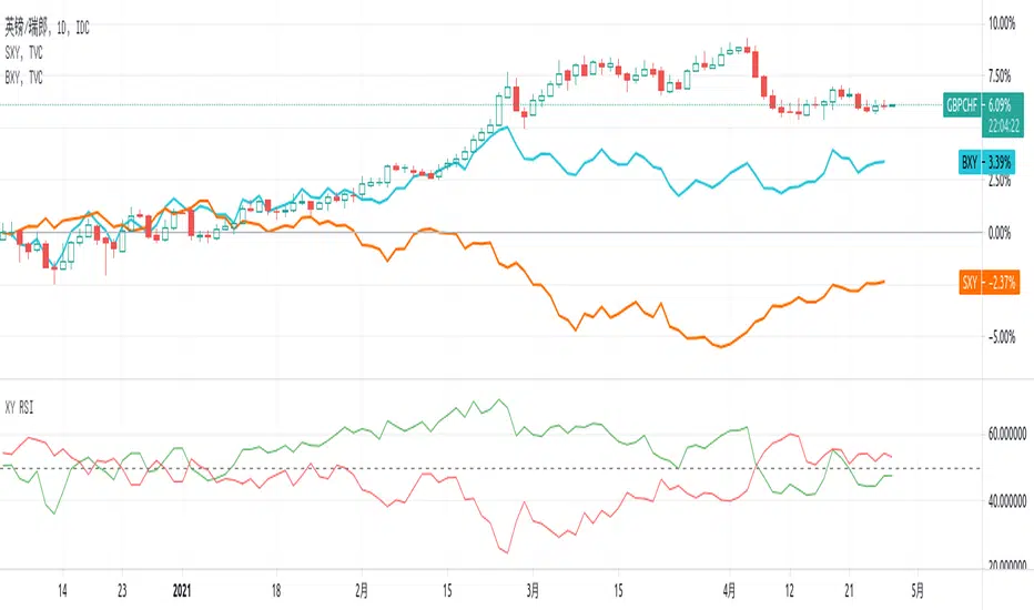
XY RSI - Relative strength IndexThis script is for Forex combinations of the following currencies: USD, EUR, GBP, JPY, CHF, AUD, NZD, CAD
- It uses security function to get 28 currency pairs, so that it may cost a few seconds to paint.
- It displays two currencies RSI index based on the chart. For example, the chart is GBPCHF, then the green line is for GBP, the red line is for CHF.
You can compare currency index (DXY, EXY, BXY, JXY, AXY, CXY, SXY, ZXY) chart on your main chart by youself to get more views on relative strength.
AM Bursa Relative Strength (Index & Stock)This is a Relative Strength Indicator developed for stocks traded at Bursa Stock Exchange, Malaysia.
This indicator uniquely allows users to:
select a Sector Index from a pre-populated index list and compare it with KLSE (Main Index) to see the relative strength trending.
Values above zero indicates that the selected Sector Index is traded stronger than the KLSE (Main Index)
Enter (manually type in) a Bursa Stock Ticker Name (Stocks #1) and compare with a Sector Index to see the relative strength trending.
Values above zero indicates that the entered Bursa stock is traded stronger than the Sector Index.
Users only need to change the Stock Ticker Name to check the relative strength for different stocks
Enter (manually type in) a second Bursa Stock Ticker Name (Stocks #2) and compare with a Sector Index to see the relative strength trending.
This allows users to compare the relative strength of two stocks (Stock #1 and Stocks #2) within the same Sector Index.
Values above zero indicates that the entered Bursa stock is traded stronger than the Sector Index.
Users only need to change the Stock Ticker Name to check the relative strength for different stocks
Users also can add Dual EMA indicator to see the trending of the relative strength values.
Important Note: Use only in Daily Time Frame Only.
Do not delete "MYX:" prefix. Just replace stock ticker name only.
Hope this indicator can help users in selecting which stock within a sector index to trade or which sector to allocate their portfolio allowing them to trade and focus on active sector.

Equilibrium Price for Relative StrengthPlot of equilibrium price of Relative Strength.
Instead of the RS ratio, this is the plot of the price that will make the RS ratio equal to zero, we call this the equilibrium price.
About the equilibrium price plot:
- When the plot is below the symbol price plot, it means stock is performing above the benchmark
- When the plot is above the symbol price plot, it means stock is underperforming in comparison to the benchmark
- When the plot is close (or equal) to the symbol price plot, it means that RS is near the zero line, either crossing over or crossing below
The latest equilibrium is displayed over the plot. This gives a visual and quantitative idea of how far above or below the equilibrium price is in comparison to the current price.
In the above example, we see that HDFC Bank which was performing above the benchmark (trading above equilibrium price) whipsawed a lot (price near equilibrium price), before swaying down during the COVID-19 fall in the market (price is trading below the equilibrium price) . Currently, the equilibrium price is 1136, but HDFC Bank is trading below this price at 1033, around 100 points below.

TMO of Relative StrengthThis indicator shows 3 TMOs, one for the charted symbol, one for a chosen index symbol, and one for the relative strength ratio of the 2 symbols.
While a normal TMO measures momentum of a stock, this indicator measures the subtle momentum shifts that happen in the relative strength ratio of the stock , which can sometimes happen before the momentum of the stock itself shifts. This provides the potential for an early warning that a move may be about to begin, even before the stock price starts heading in one direction.
Many traders watch relative strength ratio charts to see when a stock begins to outperform the index. This indicator doesn't measure the relative or comparative strength ratio itself, but instead measures the change in momentum of relative strength .
Signals and alerts are provided for when the Ratio's TMO line crosses above/below the Stock's TMO line, or the Market Index's TMO line, and also for when the Stock's TMO line crosses above/below the Market's TMO line even if the ratio isn't crossing currently. Also alerts when the Ratio or Stock TMO lines cross their prior values.
I created a version of this for Thinkorswim originally and it has been valuable to me and my clients, so I hope it provides value here as well.
-Josiah
